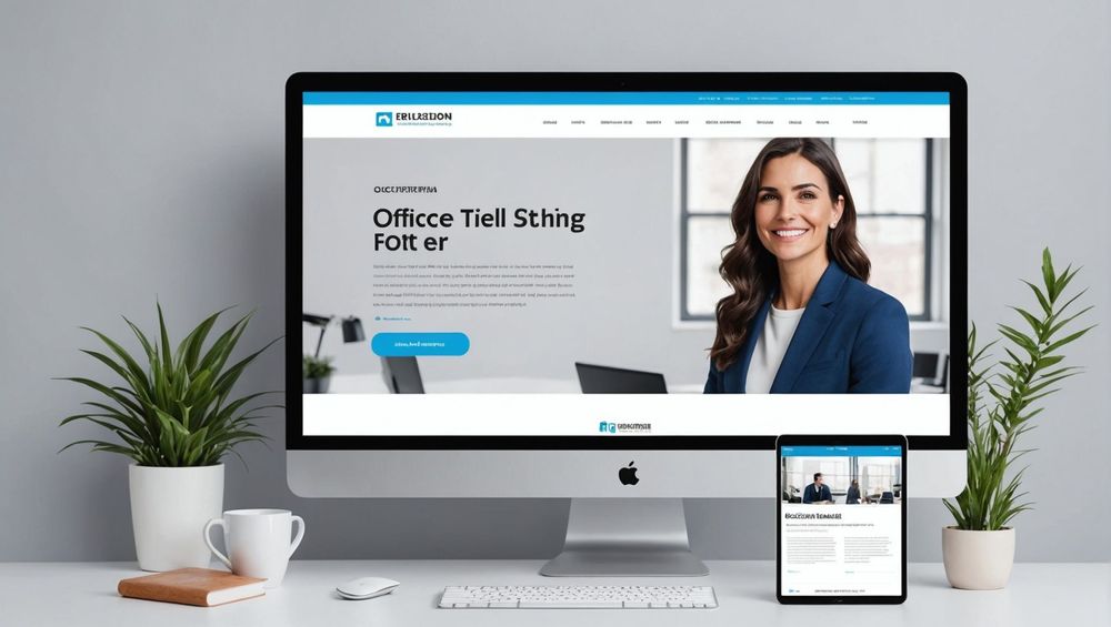
As the digital landscape continues to evolve, so too must our strategies for capturing user attention. In 2024, the principles of effective landing page design remain crucial for converting visitors into customers. This article delves into inspiring examples of landing page designs that stand out and can inspire you to create your own high-converting pages.
Minimalist Designs That Maximize Impact

Minimalist designs use simplicity to draw attention to the core message and call-to-action (CTA). By reducing clutter and focusing on essential elements, these landing pages guide users directly to the desired action. A great example of minimalism in landing page design can be seen in Basecamp’s site, which uses plenty of white space, a single compelling image, and a brief message emphasizing the benefits of signing up.
The key elements of a minimalist landing page include:
- Plenty of white space for breathing room.
- A concise and compelling headline.
- A prominent, eye-catching CTA.
Interactive and Dynamic Landing Pages

Interactive landing pages engage users through dynamic content such as animations, sliders, and videos. This type of design captures attention and can explain complex information in an easy-to-digest manner. One standout example is the landing page for Slack, which showcases its features through an interactive, multimedia experience.
The benefits of using interactive elements include:
- Enhanced user engagement and retention.
- Improved communication of your product’s value.
- Higher likelihood of converting visitors into leads.
Personalized User Experiences

Personalization in landing page design involves tailoring content to individual user preferences or behaviors. This approach can significantly boost conversions by making users feel understood and valued. Amazon’s landing pages, for instance, often feature personalized product recommendations based on users’ past interactions.
Strategies for effective personalization include:
- Using data analytics to understand user behavior.
- Segmenting your audience and tailoring messaging.
- Implementing dynamic content that changes based on user input.
Use of Strong Visuals and Graphics
Strong visuals and graphics can make a landing page more appealing and engaging. High-quality images, illustrations, and videos can communicate your message more effectively than text alone. Dropbox, for instance, uses bold visuals and concise text to clearly convey their service’s benefits.
Key elements of effective visual design include:
- High-resolution images that resonate with the audience.
- Consistent branding through colors and typography.
- Visual hierarchy to guide the user’s eye to the CTA.
Optimizing for Mobile Devices
In a mobile-first world, optimizing your landing pages for mobile devices is no longer optional—it’s a necessity. With the majority of users accessing websites via smartphones, a mobile-optimized design ensures a seamless and enjoyable experience across all devices. One leading example is Airbnb, whose mobile landing page retains all functionalities and aesthetics of its desktop version.
Steps to ensure mobile optimization include:
- Using responsive design frameworks.
- Ensuring fast load times by minimizing heavy content.
- Designing intuitive and easy-to-click buttons.
Conclusion
Developing a successful landing page in 2024 requires a blend of strategic design elements that captivate and convert. From minimalist layouts to personalized experiences and mobile optimization, these examples illustrate how to craft landing pages that not only look great but also perform exceptionally well. Incorporating these best practices into your own design can lead to higher conversions and an overall better user experience.
FAQ
What is the most important aspect of a landing page design?
The most important aspect is ensuring a strong, clear call-to-action (CTA) that guides users toward the desired action without distractions.
How can I measure the effectiveness of my landing page?
Utilize analytics tools to measure key metrics such as conversion rate, bounce rate, and average session duration for comprehensive insights.
Are animated elements effective in landing page design?
Yes, when used judiciously, animations can significantly enhance user engagement and retention, making the user experience more dynamic and informative.
What role does personalization play in landing page success?
Personalization can significantly boost conversions by making users feel understood and valued, ultimately enhancing user experience and engagement.
Why is mobile optimization crucial for landing pages?
With the majority of users accessing the web via mobile devices, ensuring a seamless and enjoyable mobile experience is crucial for retaining visitors and improving conversions.
