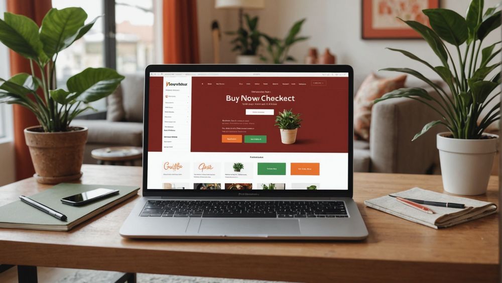
In the digital marketing world, the effectiveness of call-to-action (CTA) buttons can make or break your online campaign. This article delves into high-converting CTA examples that prompt users to act immediately. Read on to uncover the methods behind these compelling CTA buttons.
Understand the Power of Action-Oriented Language

Action-oriented language is key in getting users to click your CTA button. Words like “discover,” “start,” and “explore” create a sense of urgency and excitement. This is enhanced further when the text addresses the user’s needs directly. For example, rather than using a generic “Submit,” “Get Your Free Report Now” is more engaging and tells users exactly what they will get.
This principle can be applied across various formats and platforms. E-commerce websites often use “Buy Now” or “Shop the Sale,” creating a sense of immediacy. Social media platforms might employ terms like “Join the Community” to foster a sense of belonging. In email marketing, “Claim Your Offer” is more enticing than “Click Here.” Therefore, the verbiage you choose directly impacts user engagement.
Incorporate FOMO (Fear of Missing Out)

The fear of missing out, or FOMO, is a powerful psychological trigger that encourages immediate action. CTAs that leverage FOMO often include a time-sensitive element. Phrases like “Limited Time Offer,” “Only a Few Spots Left,” or “Ending Soon” create a sense of urgency that compels users to act quickly.
Using this tactic effectively requires honesty; deceptive urgency can harm your brand’s reputation. ECommerce platforms often display stock levels to emphasize scarcity. Email campaigns can use timers counting down to a deal’s expiration. This not only boosts clicks but can also increase the conversion rate of sales pages and sign-up forms.
Highlight Benefits, Not Features

Focusing on benefits rather than features is crucial for an effective CTA. Users are more likely to click if they understand the tangible benefits they will receive. Rather than stating, “Subscribe to Our Newsletter,” a more effective CTA would be, “Get Weekly Tips to Triple Your Productivity!” This makes it clear what the user stands to gain.
When users understand how they will benefit, they are more inclined to take action. Transform your CTAs to emphasize outcomes: “Learn More” becomes “Discover How to Save 20% on Your Next Purchase.” This strategy is widely applicable, from landing pages to social media ads and email newsletters. Essential benefits should be clear at first glance.
Test Various Designs and Placements
A well-designed button is hard to ignore. The color, size, and placement of your CTA button can significantly impact its effectiveness. Studies suggest that bright colors like red and orange often result in higher click-through rates. Placement is equally important; CTAs should be positioned where users naturally look or scroll.
Conduct A/B testing to determine which designs and placements work best. This involves creating two versions of a page and comparing performance. Try placing CTAs above the fold, at the page’s conclusion, or within the content. A well-placed CTA can significantly increase user interaction and conversion rates.
Numbers and Lists Drive Action
Using numbers in your CTAs can also make them more compelling. For instance, “Get 50% Off Now” is more specific and persuasive than “Save Now.” Lists work similarly by offering a clear, tangible benefit. Consider using a numbered list within your article to drive user engagement.
- Highlight the main value of your product or service.
- Introduce time-limited offers or additional benefits.
- Use action verbs and clear, concise text.
- Place CTAs strategically for maximum visibility.
- Regularly analyze and optimize CTA performance.
Numbers and lists provide clarity and focus. They make the benefits and actions required from the user unmistakable, thereby improving the chances of interaction.
Conclusion
Effective CTAs are essential in converting website visitors into customers. By using action-oriented language, leveraging FOMO, highlighting benefits, carefully testing designs and placements, and incorporating numbers, you can create CTAs that users can’t help but click. These strategies don’t just improve click-through rates but significantly enhance the overall user experience.
FAQ
An effective CTA button uses action-oriented language, stands out visually, and clearly explains the benefits of clicking it. Timing and placement also play crucial roles.
Why should I use FOMO in my CTA?
FOMO creates a sense of urgency, making people believe they might miss out on something valuable. This sense of urgency can significantly increase the likelihood of a click.
How can I test the effectiveness of my CTA?
You can test the effectiveness of your CTA through A/B testing. This involves creating two versions of a page with different CTAs and analyzing which performs better in terms of click-through rates and conversions.
Bright colors like red, orange, and green often perform well for CTA buttons because they stand out. However, the ideal color may vary depending on your website’s design and color scheme.
Why should CTAs focus on benefits rather than features?
Users are more interested in how they will benefit rather than a list of features. Highlighting benefits makes it easier for users to understand the value of taking action, thus increasing the likelihood of a click.
